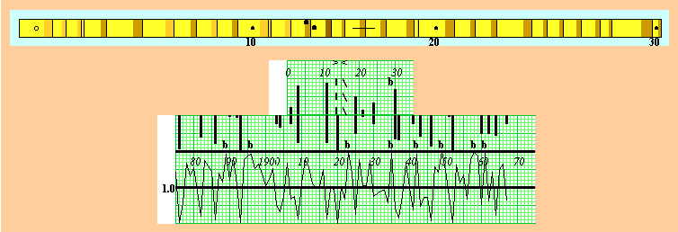

To skeleton plot a sample onto a strip of graph paper, simply make marks according to the relative narrowness of each ring, as illustrated in the figure above. The graph marks range from no mark at all (not narrow) to a vertical mark of ten graph lines in length (extremely narrow). Note that ring #11 of the sample above is quite narrow relative to its neighboring rings and that its corresponding mark on the 11th line of the skeleton plot (the short graph strip) is nine lines long. In contrast to that, ring #24 is only slightly narrow relative to the preceding ring and its corresponding graph mark is only three lines long. Occasionally a notably wide ring occurs (e.g., ring #29 above), prompting dendrochronologists to mark a "b" (indicating big) on the corresponding vertical line of the graph paper. When you skeleton plot with the applet, you are given a virtual increment core sample of tree rings extending from left to right through time as well as a virtual strip of graph paper. Make a normal mark on the graph paper by simply putting the mouse cursor on the correct vertical line and at the height (horizontal line) you desire and then click the left mouse button. Similarly, make a "b" mark by selecting the wide option when drawing marks. If you make a mistake, turn the eraser on and click over that (or any other mark you wish to erase). Don't forget to turn the drawer back on to continue making marks. You can also move the graph strip left or right by clicking and holding the left mouse button in the top part of the graph and moving the mouse.
Most of the other rings of the sample are merely average in width, and no mark at all is made on their corresponding vertical lines of the graph strip. Dendrochronologists typically accentuate narrow rings when skeleton plotting because narrow rings are consistently expressed by most, if not all, trees within a particular stand. Average rings are simply not marked on skeleton plots. Furthermore, it is not necessary for every dendrochronologist to skeleton plot a particular sample identically to succeed at crossdating, rather it is only necessary that the relative growth variation through time be consistently skeleton plotted with the relatively long or short marks.
Once a sample is skeleton plotted, the plot is compared to an existing dated master chronology to match its pattern of marks in mirror image and thus find the exact years of formation of all rings. The dated master chronology above is constructed from previously crossdated samples, it extends from 1875 to 1963, and it has a time series of standardized growth indices that average 1.0 and that range from 0.0 (very little growth) to 2.0 (maximum growth). The master is also marked as if it were a skeleton plot, with small indices represented by long marks and large indices represented by "b" marks. (For a good idea of how to make marks when skeleton plotting, look at the master chronology to see what values of ring growth merit a long mark versus no mark at all versus a "b" mark). By sliding the skeleton plot left and right relative to the master, the mirror image of the pattern of marks was found (even the "b" mark for ring #29 matches that for the year 1935) and this sample has a start year for ring #0 of 1906 and an end year for ring #30 of 1936. To match patterns on the applet, show the master chronology and switch the graphs to an appropriate size for your computer monitor. Then, move the master chronology left or right by clicking and holding the left mouse button in the time series portion of the chronology graph and moving the mouse. The goal is to find where the marks on the skeleton plot match those of the master in mirror image. When you see a match, you can then determine the start and end years of the sample.
Note that the sample above has an absent ring anomaly: the chronology has a index value of 0.0 for 1920, which corresponds to the sample ring #14, which is quite normal. In reality, this sample failed to grow a ring that year, and to indicate this anomaly two offset dots are placed on the sample around the boundary for rings #13 and #14 and a dashed line is drawn on the skeleton plot between the 13th and 14th lines. To maintain proper timing, the skeleton plot must then be slid one graph unit to the right relative to the master chronology. On the applet, make an absent ring mark by selecting the "draw absent" option and using the mouse as before and then move the skeleton plot one position to the right.
Note also that the sample above has a false ring anomaly: the chronology has a index value of 2.0 for 1923, which corresponds to the sample ring #16, which is quite normal. In reality, this sample grew two rings that year, and to indicate this anomaly a line is drawn across the boundary for rings #16 and #17 and a dashed diagonal line is drawn on the skeleton plot on the 16th line. To maintain proper timing, the skeleton plot must then be slid one graph unit to the left relative to the master chronology. On the applet, make a false ring mark by selecting the "draw false" option and using the mouse as before and then move the skeleton plot one position to the left.